
Citi Bike
Easy way to find your rides and stations.
About Project
Enhancing bike sharing system to helps users find a bike and station easily
Citi Bike is a bicycle sharing system in NYC and many people use it as an alternative to public transportation. A bike can be found and returned at docking stations, and people usually use the app to find them. The app shows how many bikes and docks are available at each station, but many times happens that it has no longer available when they get there or has found nothing nearby. From this case study, I wanted to find if other riders are facing this problem and design a feature that can help riders to find available stations quickly and easily.
My Role
User Research, UI/UX Design, Wireframe, Prototyping
Duration
8 weeks
Tool Used
Figma, Adobe Photoshop, Adobe Illustrator

Problem
Citi Bike riders struggle to find an available bike and dock in time
Over 1,000 Citi Bike stations are located in NYC, they easily can be found around the street. Yet, people still have experienced difficulties finding a bike whenever they need it. So I questioned why this problem arises and how we can improve it.
Solution
Enhancing a tracking feature that allows users to find an available station and expanding its reliability with a rewards program.

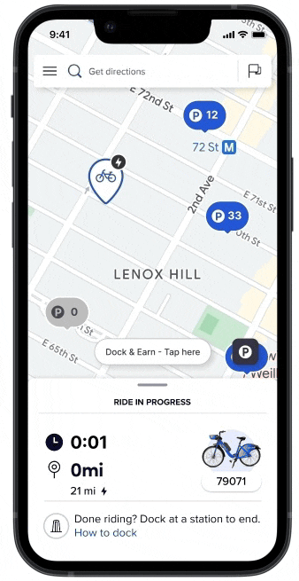
Automatically identify available stations with real-time station status
When users open the Citi Bike app, it will automatically show an available station near them. The app keeps following the status of the bike station when users are heading to the destination. If the station is no longer available, notify users and reroute to the nearest station.
Expanded rewards program that will enhance bike station availability
As many people join the rewards program, it improves the bike availability at each station. The previous rewards program is only for the users who joined the Bike Angel program but I expanded the program to allow all users to earn rewards for redistributing bikes to stations running low.

Research Plan
Defining research objectives
Before I deep dive into the problem, I wanted to understand the user’s motivations, needs, and frustrations behind using Citi Bike. To better understand the service, I conducted market research about Citi Bike, analyzed competitors, and talked to people who have experience in a bike-share app. My goals included the following:
Discover a user’s motivations behind using a bike share
Understand why and when users using a bike share
Identify any pain points during the process of using a bike share
Learn about other competitors and how they provide service to users
Research
Defining problems from the customers
To understand the problems users are facing, I started reading app reviews in the app store. I found common patterns from their experiences, in which they expected to find one available station nearby but it was not successful. These are the main three reasons why:
1 ) The station was empty or full
2 ) It does not show alternative options when the original station is no longer available
3 ) It confuses where the nearest station is located at.


Competitive Analysis
Comparing bike-sharing systems
Unlike Citi Bike uses a dock-based system, many competitors use a dockless system for their mobility share service. I started to compare the differences between the two systems and found an interesting fact: limited numbers of docks in the dock-based system influence unbalanced bike distribution at each station. On the contrary, a dockless system has flexibility on parking locations and numbers of bikes.


User Research
Interviews revealed 3 pain points in peoples’ experiences.
To deep into my research, I conducted 1-on-1 interviews with 5 people who had experience in the Citi Bike app or other mobility-sharing apps. Through the interviews, I was able to validate the problems and understand their needs.

🤯
“I confuses where is an available station nearby”
⇣
Insight:
Users confuse which station is nearby and available. They would like to know an available station quickly without many clicks.

😓
“It is difficult to find alternative option when a station is unavailable”
⇣
Insight:
While users make their way, the bike stations often change their status to no longer available. Most of the time, users had to find another station when they arrived.

🤨
“In certain areas, a station is always full or empty”
⇣
Insight:
In certain areas, the stations are always empty or full. Many users feel inconvenienced by the service being unable to not find it when they need it.
Defining the problem
How could I translate these pain points into design opportunities?
🤯
“I confuses where is an available station nearby”
⇣

How might we automatically locate the available station?
😓
“It is difficult to find alternative option when a station is unavailable”
⇣

How might we keep track on the available station while riding?
🤨
“In certain areas, a station is always full or empty”
⇣

How might we expand rewards programs to rebalancing the bikes?

User Persona
Meet Ben, a sales manager who is working in Midtown, NY
With my insights from the interviews, I created a persona that can help me stay focused on the user’s motivations, goals, and frustrations. Ben is a sales manager who is working in Midtown New York and usually uses Citi Bike for commuting. He always checks the bike availability when he leaves home, but, the number of bikes changes so quickly during rush hour. He wants to find an available bike station easily and quickly.
Ideating the solution
Aligning design with user behavior
After I brainstormed three potential solutions, I created a task and user flow to learn how users would interact with the new features. For the main goal - finding an available station, I focused on two features which are 1 ) An automatic station finder and 2 ) Use rewards program with a preferred station. Through the flows, I could understand what actions users would need to take in order to use new features.

Ideating the solution
Visualizing ideas with Storyboard
With the task and user flow process, I learned how users would interact with the new features. To understand better the user experiences with products, I started to visualize user stories with a storyboard. The user stories included: Finding and returning a Citi Bike, Getting rewards with a preferred docking station(To rebalancing bike availability). The process of storyboarding helped me notice a gap in my design thinking and clarified my ideas for the new features.
Validating ideas and getting feedback
Testing Low-Fidelity Wireframes
To validate my ideas for the solutions, I conducted usability tests on wireframes with users. The first question was what they thought about the overall UI designs for icons, buttons, and maps. In previous UI designs users confused which station is available, so I wanted to provide more intuitive UIs for users to find bike availability easily. My initial idea was to show three different colors depending on the number of available bikes, but I noticed that the color differences were not as effective as I thought, and also were not considered for colorblind people. This is what I learned from early testing:
Users confused the meaning of numbers without icons
The colors and texts should be accessible
Users would like to make a selected pin bigger than other pins


UI designs
Citi Bike: Style Tile
I was surprised that the Citi Bike has no organized design systems related to its brand color or fonts. So I was trying to find a similar font and colors to the current UI designs.

Solution #1
How might we automatically locate the available station nearby?
Find the nearest station with one tap
The app will automatically find the available station when users open the app. When users want to go to the following station, they can find the travel time and distance to estimate the arrival time.


Solution #2
How might we send a notification with unavailable stations and reroute to another station?

Send alerts with unavailable station and reroute to another station
If the station status has changed while users are riding, the app will send a notification and reroute to the next available station. With new updates, users can return a bike successfully without worries.

Solution #3
How might we expand rewards programs to all users for rebalancing the bikes?
More join the rewards program and more increase bike availability
When users return a bike in the highlighted stations(running low or empty), they will earn rewards. If more users join the rewards program will help to rebalance the bike availability and increase bike accessibility.


Usability test and iterate
Usability Testing with Hi-Fi Prototype
After conducting usability testing with 8 participants, I noticed that most of the feedback was about the flows and interactions. This is what I learned:
All participants were positive about the new features and liked its convenience
(e.g. finding the nearest station and tracking available stations)
Users wanted to have alternative options automatically when they get a notification
The map flow of the rewards program was a little confusing
All participants are interested in the rewards program
Icons
Problem: Users are confused about which numbers are for a bike or docking station.
Solution: I added a bike and P(parking) icon to recognize each stations.


Accessibility
Problem: It is difficult to distinguish color tones and contrast for colorblind people.
Solution: I used contrasting outlines and colors for an accessible user interface.
An Automatic Rerouting System
Problem: Users wanted to reroute alternative stations when they got a notification.
Solution: I skipped the station selection page and automatically reroute to another station.

Map Flows
Problem: The map interaction was confusing with too many screens and movements.
Solution: I simplified the interactions and focused to show the main feature(rewards program).

Final Design
-

Finding the nearest bike station
-

Getting alerts with available stations
-

Earn rewards with preferred stations

Reflection
Reflection and Next Steps
This project was fun and exciting because I use this app often and also I had a chance to use other apps(like birds, lime apps) in the other city. Through my experiences, I was able to find a better solution for the current app by learning how other apps work.
The goal was to make a feature that would be adopted to the current app with no frictionless and happy to see the positive feedback at results. When I go to move forward to the next steps, I also want to add a reservation feature that could be another solution for this project.
More Projects:
Pacer
Workout Routine • End-to-End Mobile App • UI/UX Design
End-to-end design of a workout routine app.

JNB Fabianny
Fashion eCommerce • Website Redesign • UI/UX Design