
Dev Launchers
Build and maintain consistent design systems for internal Dev Launchers teams.
About Project
Building responsive grids and guidelines to maintain the consistency of the Dev Launchers design system.
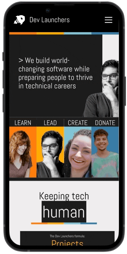
Dev Launchers is a non-profit organization for both tech and non-tech professionals, providing them with the opportunity to build and share skills while collaborating on projects. Our project goal is to establish a consistent design system for the entire team. The current website faces a major issue of inconsistency with varying layouts, as each team employs a different grid layout without established guidelines for margins and spacing.
My Role
UI/UX Design, Prototyping, Design System and Documentation
Team
Anouar N, Project Lead
Lina K, UX Designer
Anna I, Accessibility Designer
Mohammed M, Engineer
Tool Used
Figma, Maze

Problem
The existing website faces a significant challenge of inconsistency due to varying layouts adopted by different teams.
Since each team manages individual website pages or projects, the absence of clear guidelines leads to confusion about the appropriate layouts, resulting in inconsistency in website layouts, margins, and spacing. This lack of uniformity contributes to an overall lack of coherence in the design.
Solution
Create and sustain a unified design system by sharing layout grid guidelines, fostering consistency across all teams and projects.
Solution #1
Grid Layouts and Guidelines
Through my research, I effectively incorporated layout grids for three devices: mobile, tablet, and desktop. To support fellow designers in seamlessly integrating layout grids into their designs, I developed comprehensive guidelines covering usage, along with detailed information on columns, margins, and width.
Solution #2
UI Components and Prototyping Advancements
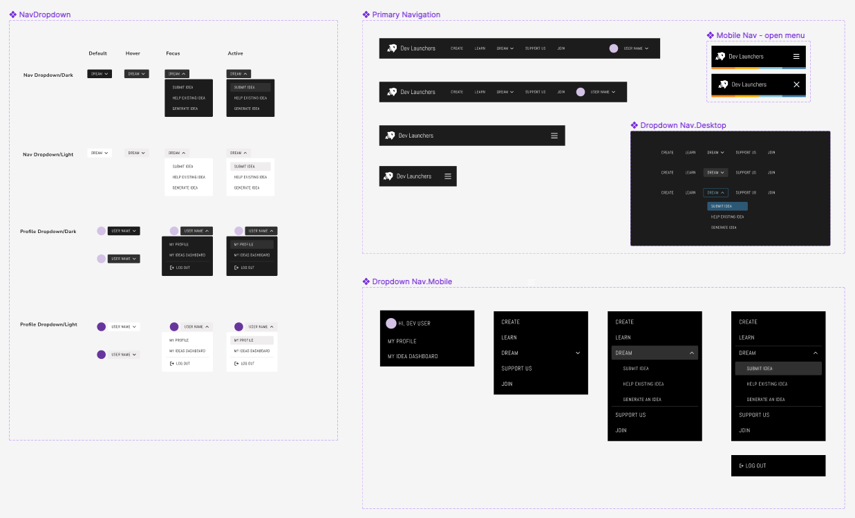
Additionally, I implemented new layout grids to refine the navigation bar, enhancing its uniformity and user-friendly aesthetics. Aligned with our redesign initiative, I didn't just overhaul the mobile navigation. I also expanded the variety of components within our design system. This refinement aims to enhance accessibility for both designers and developers. I meticulously organized components, ensuring seamless adaptability across mobile and desktop devices, offering a considerable degree of flexibility in the process.
Navigation and Dropdown - Desktop, Tablet, Mobile
Mobile Navigation Prototype
Overview
Navigating Stakeholders at Dev Launchers
Dev Launchers' website operates as a central hub for the tech community, facilitating the exchange and advancement of skills. Within this vibrant ecosystem, two pivotal groups of stakeholders assume integral roles:

1. External users who explore the Dev Launchers website to acquire knowledge about coding and design through the open-source software shared by the community

2. Internal stakeholders including myself as a UX designer, contribute to the development of tailored design systems that cater to the unique needs of our team members. Our team, consisting of UX researchers, designers, developers, and product leads, collaborates with a shared focus on enhancing the overall user experience for the website.
Project Kickoff
Project Kickoff with Designers and Developers
During these sessions, I facilitated insightful conversations to delve into their experiences with grid layouts and to gain a deeper understanding of their day-to-day practices in design and development.
Provide an overview of the project's background and context.
Establish a shared understanding of the project's scope and goals.
Identify potential challenges and opportunities.
Project kickoff presentation
Research users
Pain Points and Needs
Pain Points and Needs Analysis
After in-depth discussions with both designers and developers, a thorough understanding of the challenges and needs surfaced. This synthesis resulted in the identification of four common needs crucial for addressing the project's complexities:

UX Designers
Inconsistent layout
Designers were confused about the spacing and margins to use, making it challenging to maintain a consistent layout throughout the website.
Responsive Design challenges
Current UI elements do not adapt well to various devices and screen sizes.
Design System & Guidelines
UX designers need design systems to define spacing standards and guidelines that can be applied consistently across the entire interface.
Developers
Learning curve with Tailwind CSS
Developers find it challenging to learn a new CSS framework and need to have clear guidelines.
Maintaining existing UI components
Integrating a new grid system with existing components while maintaining responsiveness can be tricky.
Documentation & Guidelines
Developers need comprehensive documentation and guidelines that outline design elements.

Problem and Goals
Identifying Common Needs
The collaborative approach with both designers and developers illuminated common needs, paving the way for focused efforts on addressing these priorities to enhance the overall design and development processes.
Consistent Layout Guidelines
Integration of Existing UI Components
Responsive Grid Solutions
Documentation for Design System


Principles
Project principles
In this project, our primary emphasis centers on three fundamental principles that serve as guiding beacons for achieving excellence:
🌐
Global Design System
Design guidelines and resources that ensure a consistent and cohesive user experience across a product
♻️
Reusable & Accessible
Create UI elements to be easily integrated into various parts of a project without the need to recreate them from scratch each time.
📄
Documentation & Guideline
Help design and development teams implement the system efficiently and accurately
Phases
Project Phases Overview
In navigating the intricacies of our project, we have outlined a comprehensive three-phase approach to ensure a successful design process.
Phase 1: Project Initiation and Exploration
Phase 2: Prototyping and Refinement
Phase 3: Quality Assurance and Documentation

Design Audit
Evaluating current designs
To initiate the process, I conducted a comprehensive assessment of our existing design system, specifically examining the grid layout employed in the project. This involved identifying any inconsistencies and pinpointing areas that could benefit from enhancement.
Furthermore, I undertook a meticulous investigation into the breakpoints employed on our website. This research proved invaluable in identifying shared breakpoints, streamlining the process of developing a new grid layout without the need to commence from the ground up.
Used a different grid layout for each page
Inspect current website breakpoints
Research
Exploration through research and data analysis
Moving forward, I conducted an in-depth analysis of data gathered through Hotjar to ascertain the prevailing devices and platforms among users visiting our website. The findings illuminated a clear trend, indicating that desktops were the most commonly utilized devices, with the majority of users employing the Windows operating system. In tandem, I delved into the examination of breakpoints within the Tailwind framework and Windows, with the objective of formulating a grid layout that is highly adaptable.
Understanding user behaviors through Hotjar and research Tailwind CSS framework
Research design systems and grids from other companies

Implementation
Layout Grids and Guidelines
Prototype
Mobile Navigation Bar
I further extended the application of the newly devised layout grids to the navigation bar, aiming to enhance consistency and intuitiveness. Prior to integrating the grid system, the text alignment exhibited inconsistencies, leading to difficulties in readability for users navigating the menu. Subsequent to the implementation, a noticeable improvement ensued, rendering the navigation more intuitive and responsive across a spectrum of devices.
Prototype
Desktop Navigation Bar
In tailoring the desktop version, I introduced new margins, breakpoints, and augmented the spacing between menu lists. These enhancements were strategically implemented to enhance readability and navigation, contributing to an improved user experience for desktop users.
Usability Testing
Usability Testing
In response to the complete redesign of our mobile navigation, a usability test was conducted to gauge user experiences with the updated navigation system. The primary objective was to assess users' ability to navigate easily and efficiently within the redesigned mobile interface.
Key Findings:
Clarification of terms in navigation links
e.g.) Join, Dream, My Idea Dashboard
We might need to conducting card sorting or creating information architecture (IA) for the website navigation
Research if we need a dropdown menu below the ‘Dream’ section
Add dividing lines on the menu lists or find a more interactive user interface that can help users interact with the full width of the screen, as they touch or click only words from the navigation.
🔴 Major = Priority 0 (must be fixed for the product to work)
🟡 Moderate = Priority 1 (include in a future release to be tested)
🔵 Minor = Priority 2 (Address further in the future)
Usability Testing Report


Design System
Hand-off UI components
I revamped component variations within our design system, ensuring seamless accessibility for both designers and developers. The components were thoughtfully organized to cater to the specific needs of both mobile and desktop devices, and variations in dark and light themes were provided for added flexibility.
Next Steps and What I Learned
Maintain Communication with Designers and Developers
During the handoff to developers, I ensure designers receive updates, fostering smooth integration of new designs into their team projects. Clear guidance is also provided to developers for effective implementation.
Embrace testing, iteration, and continuous improvement
Recognizing that there is no final design or product, I emphasize an ongoing commitment to improvement. Regular stakeholder feedback informs iterative design processes, driving continuous enhancements for optimal solutions.
Website IA and homepage design in the next sprint
Post usability testing, it became evident that users, including internal ones, faced confusion regarding website structure and information, especially the purpose of each navigation menu. Acknowledging this, I realized that organizing overall website IA and creating a sitemap would not only enhance organizational clarity but also elevate the user experience. This insight shapes our focus on the upcoming homepage design in the next sprint.
More Projects:

Citi Bike
Bike Share • Add a feature • UI/UX Design
Easy way to find your rides and stations.
Pacer
Workout Routine • End-to-End Mobile App • UI/UX Design